
Introduction
The foundation of a successful e-commerce site lies in seamlessly executing user experience (UX), which goes beyond visual appeal. UX drives interactions, guides each click, and steers a visitor's journey from initial curiosity to final conversion, prompting them to make a purchase and complete the transaction. This guide explores how to identify a mistake in UX design and execute a successful overhaul that delivers results. Additionally, we'll share some ways of eCommerce website redesigns to help you get started.
1. Poor Navigation and Search Bar
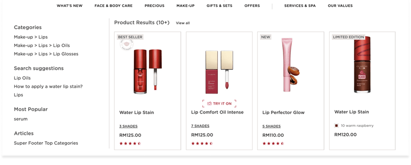
Many e-commerce websites suffer from cluttered menus, confusing categories, and an ineffective search bar. A key mistake in search system design is not offering a natural query language, that matches your user’s expectation.This makes it difficult for customers to find the products they want quickly and easily.
Ways to Improve:
- Organize products into relevant categories and subcategories.
- Streamline navigation to help users find products quickly and easily.
- Place a prominent, easy-to-use search bar at the top of every page.
- Implement advanced search algorithms with autocomplete suggestions and relevant filters.
- Include features like spell-check to assist users in finding what they need.
2. Your website is slow
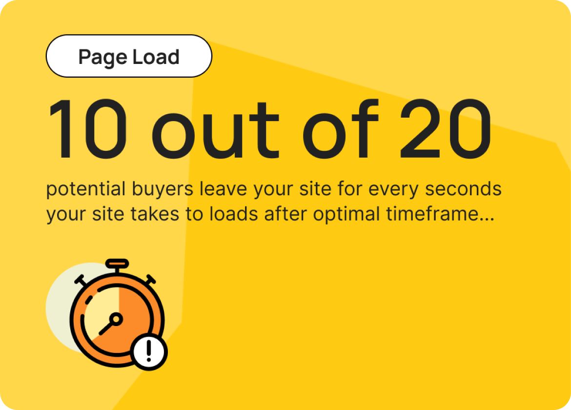
The loading speed of your page is one of the top reasons why users choose not to revisit your eCommerce site. Slow load times and glitchy websites frustrate customers, resulting in higher bounce rates and increased shopping cart abandonment. Research conducted by major firms over decades has focused on determining the optimal timeframe to capture users' attention.
A study by Google revealed that as page load time goes from 1 to >3 seconds, the probability of bounce increases by 32%.
Ways to Improve:
- Optimize Images:
- Compress images using apps like TinyIMG or Crush.pics.
- Implement lazy loading for images to load them only when they come into the viewport.
- Leverage Browser Caching:
- Store static resources in users' browsers to reduce load times on subsequent visits
- Use third-party apps to manage caching more effectively.
- Prioritize Critical Content:
- Use preloading techniques for critical assets.
- Simplify your homepage and landing pages to load the most important elements quickly.
3. Complicated Checkout Process
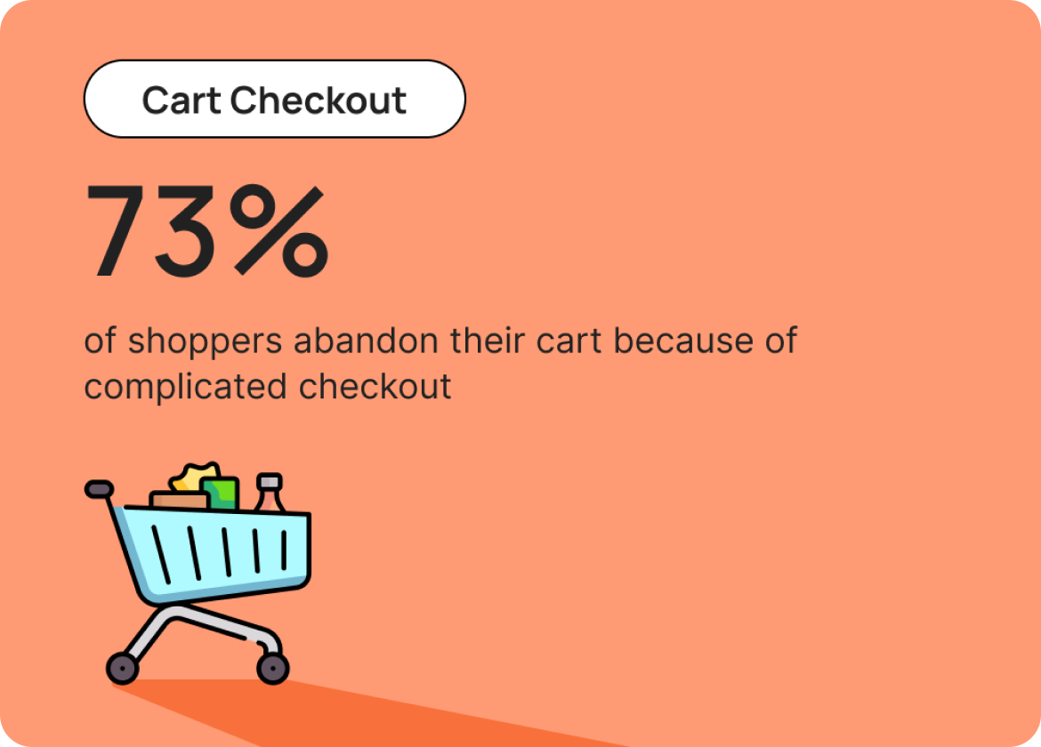
Most e-commerce sites require users to create an account before checking out, but a lengthy and complicated checkout process often leads to cart abandonment. Too many steps, mandatory account creation, and limited payment options can deter customers from completing their purchases. Reports show that nearly 73% of shoppers abandon their carts due to a complicated checkout process and insecure payment methods.
Ways to Improve:
- Reduce the number of checkout steps
- Offer a guest checkout option
- Integrate multiple payment gateways
- Streamline form fields
- Provide clear, concise instructions
4. Weak Product Descriptions and Images
Would you buy an unlabelled bottle of water from an unknown source? Most buyers won't purchase something unfamiliar. Insufficient or low-quality product images and vague descriptions fail to provide customers with the information they need to make informed purchasing decisions. Furthermore, you're missing an important step in enhancing SEO by using meta-tags and relevant keywords to describe your products so that buyers can easily reach your products through search engines.
Ways to Improve
-
High-Quality Images:
- Use high-resolution images.
- Include multiple angles of the product.
- Utilize zoom functionality for detailed viewing.
- Add videos for a more immersive experience.
-
Detailed Descriptions:
- Provide comprehensive product details, including materials, dimensions, and weight.
- Highlight key features and benefits.
- Include usage instructions and care information.
-
SEO Optimization:
- Use relevant keywords in product titles and descriptions.
- Add meta tags and alt text for images.
- Write unique and engaging product descriptions.
5. Non-Responsive Design
In today's mobile-driven world, a non-responsive website is a major setback. Websites that don't adapt to different screen sizes and devices frustrate users and drive them away. Additionally, search engines like Google prioritize mobile-friendly websites in their rankings, so a non-responsive site can also negatively impact your search engine visibility and overall traffic.
Ways to Improve
-
Use Responsive Design:
- Implement a responsive design framework (e.g., Bootstrap, Foundation) that adjusts layout and content based on screen size.
-
Flexible Images and Media:
- Make images and media elements flexible and fluid to ensure no content or photo is cut off from screen
-
Font and Text Optimization:
- Use relative units (em, rem) for font sizes to ensure readability across devices.
-
Touch-Friendly Navigation:
- Optimize navigation menus and buttons for touchscreens, ensuring they are easy to tap and navigate.


